YING YUN-WEI: ANCIENT FONTS REMADE
| September 2, 2011 | Post In LEAP 10
In our information age, electronic media have changed attitudes toward traditional printed texts, and toward printed characters themselves. New technology has engendered a new aesthetic for character form, one that inevitably feels overly cold and rigid. Against this, traditional typefaces are starting to make a comeback. Ying Yun-Wei is one designer adopting traditional character forms to create new computer typefaces.
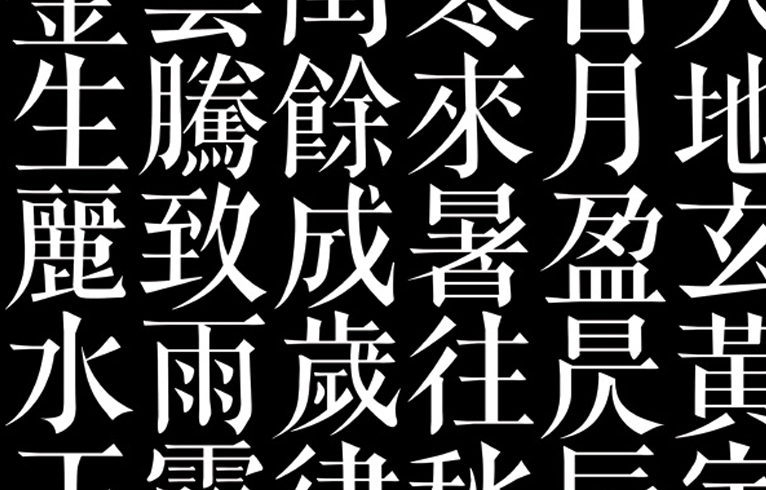
The Chinese version of the article you’re now reading, along with the majority of the Chinese text in LEAP, is written in a variant of the songti font, a derivative of Song Dynasty woodblock techniques created to suit the demands of the world’s first movable type. Song characters are well balanced, with horizontal strokes slim relative to vertical strokes. In the course of repeated printings, to prevent wear and tear on the delicate horizontal strokes, each stroke was given a slight bulge at its tip, almost like a triangle. The font made its way to Japan during the Ming Dynasty, with the result that it’s sometimes referred to as mingti.
In ancient China, the kaiti, with its traces of calligraphy, was more commonly used in printing. Comparing it with the songti, the differences between calligraphic and printed figures are most obvious: developed after the advent of movable print type, songti characters are more regular in shape, more “squared.” Because the character strokes are finer, more songti characters can be fit onto a single printed page, a seemingly small detail which had major ramifications for the intellectual modernization of Chinese civilization.
As a consequence of the explosive growth in knowledge that birthed our current “information age,” untold quantities of data are transmitted through both traditional and electronic media. Under this informational onslaught, characters, the vehicle for all this content, must themselves change. No matter the time period, typefaces have changed to suit the demands of the transmitting technology and habits of readers. In practice, this has lead to characters with more regular structures written in smoother strokes that better fit high-density typesetting and cramped electronic displays. A reader of Chinese could be excused for thinking they have seen quite enough of this kind of dull, impersonal font. Perhaps unsurprisingly, there’s been an uptick in people longing for the typefaces of days gone by (not unlike a similar embrace of vintage Roman fonts in recent years in the West). Among them is designer Ying Yun-Wei.
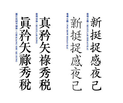
Ying Yun-Wei comes from Xiangshan, an island near Ningbo in Zhejiang province on China’s eastern coast. As a child, he loved anything and everything that connected the present with the past. As an adult, he works in Shanghai as a print designer. For the past few years, he has sunk his free time into digitizing typefaces originally designed for traditional printing methods. He has already completed five thousand characters (both traditional and simplified) of what he calls Chekiang Shu Ke Sung (lit: “Zhejiang-style Song engravings”; the odd spelling comes from Ying’s stylistic preference for the older Wade-Giles system of Mandarin romanization), and more than two thousand characters of another typeface called Pochow Hsiao Kai (lit: “Little Bozhou kai characters”). At the same time, he has begun work on a millennia-old character set by the name of Chi Kuo Sung (lit: “characters drawn from antiquity”).
Even with his other typefaces, Chekiang Shu Ke Sung has commanded the larger part of his time. Just as its name would suggest, the font is derived from a character set used by a book engraving shop in Shaoxing, a city in Zhejiang. The first time Ying laid eyes on the characters, it was in a photocopy of an old book. Later he saw work done by the Japanese type design firm Kinkido that had used characters drawn from old books as a blueprint for computer fonts. From this discovery, his method gradually emerged. The Chekiang font is an offshoot of the Song character family. Imbued with a simple, straightforward grace by their origins in worn wooden engraving blocks, its characters are exceedingly elegant. It was this quality that attracted Ying in the first place.
Several very precise obstacles stand in the way of any designer hoping to digitize characters originally created for woodblock printing. The size of the characters and the space between them must be made uniform. The density and thickness of the characters’ strokes has to be adjusted as well. Downward strokes to the left or the right are often overly exaggerated, traces of their calligraphic heritage. Also, allowances have to be made for modern books’ arrangement of characters from left to right (as opposed to the traditional vertical arrangement of characters).
Individual Chinese characters are built from smaller components, namely, radicals. Most type design firms and designers use these radicals to typeset their characters in relatively similar ways. In order to preserve the unique nature and feel of his traditional characters, Ying had to take a different approach. Even though his tools— sheets of paper, a computer— might not be traditional tools, in his hand-crafting of each individual character, he walks in the footsteps of the traditional engraver. For one, the process of creating a character is incredibly slow, but the result is that each character is one of a kind. The same component may look slightly different across different characters. In this way, the original form of a character is preserved, as is its charm. So that his typeface could actually be used in daily communication, he also especially created a set of simplified characters (traditional characters are no longer used in Mainland China).
In Mainland China there are very few fonts adapted from older typefaces, and those that do exist have yet to be systematized. Add to that the ineffectiveness of intellectual property law and rampant piracy, and large type-design companies can rarely produce a return on investment. The work of independent type designers is even more lonely and thankless. For Ying Yun-Wei, the daily toil of creating characters is, more than anything else, a kind of spiritual nourishment.
It is my hope that with the resurgence of traditional typefaces will help generate a sustainable platform for the distribution and sale of new fonts, and that more people and organizations take it upon themselves to digitize traditional Chinese typefaces, and through research ascertain proper methods for electronic screen display. For no matter the medium, we all deserve to read beautiful characters.