BOUND FOR BEAUTY: NINETEEN NOTABLE BOOK DESIGNS
| September 5, 2011 | Post In LEAP 10
These are 19 of the most beautifully designed books we have come across in recent years. The majority are artist monographs or otherwise art-related, and some are publications on visual culture in general, but worth noting is that a good number of them are independently published. Most importantly, though, whether due to corporeal chaos or to reserved simplicity, we might surmise from these works that designers in China possess a much more solid and thorough understanding of books than ever before.
a.
NEW YORK PARIS ZHUMADIAN
Designer: Xia Yu, Meng Ke (To Meet You Design Studio)
Publisher: Vitamin Creative Space
Year of Publication: 2007
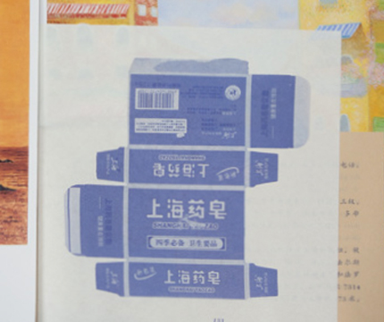
This book brings together the artist Duan Jianyu’s paintings with one of her novels. Acknowledging the presence of the two different art forms, the designers chose to use paper of various sizes and material. The pages of the novel are of smaller, thinner, pink newspaper, while the pictures of maps on the back of milk cartons are painted onto material like that used in packing boxes, a craft paper rough on one side and smooth on the other. Images are printed on the smooth side and maps on the rough, each meant to recall the feel of the original works. Illustrations printed on yellow craft paper are yet another homage to the original. To help Duan’s oil paintings— the smallest part of the book— stand out, the designers chose to print them on individual sheets of copperplate paper inserted into the book. With the variety of materials used, the final product resembles not so much a book as a folder stuffed with the artist’s works.
b.
HU XIAOYUAN
Designer: Guang Yu
Publisher: Badger & Press
Year of Publication: 2010
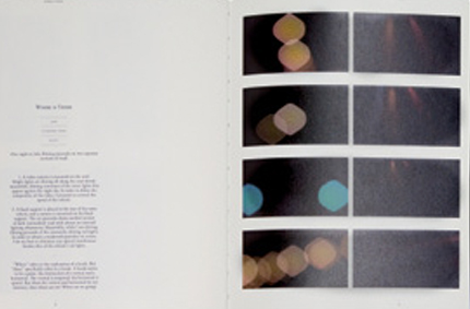
Hu Xiaoyuan had a request for designer Guang Yu: don’t make her femininity obvious. Gender-wise, she wanted the book to be as neutral as possible. As such, rather than taking his usual approach, Guang focused his energy on the details of layout design (like the size of the writing, or the distance between characters), while making everything else about the book as ordinary as possible. The cover is of light charcoal Eska board, an extremely common material almost impossible to avoid. The book’s pages are the kind of printing paper used in ordinary albums. The font Guang used— Caslon— is equally common.
c.
WANG GUANGLE: TERRAZZO
Designer: Guang Yu
Publisher: onemoon
Year of Publication: 2005
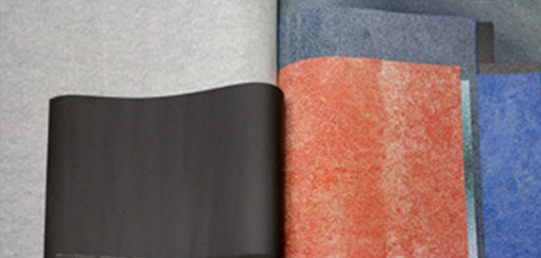
A collection of the works from Wang Guangle’s “Terrazzo” series, the cover of this book is made from two actual blocks of the material. Its sheer mass is a shock. In counterpoint to the weight of the volume’s cover, its pages are lissome and light. Each of the paintings is printed in full bleed on pages of identical size. The paper’s slick coating endows the printed works with a texture markedly different from the original oil-on-canvas works, yet still wholly faithful to the texture of terrazzo.
d.
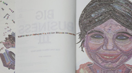
BIG BUSINESS III
Designer: Hei Yiyang (SenseTeam)
Publisher: Sendpoints
Year of Publication: 2010
Every two or three years since 2005, Shenzhen’s SenseTeam design group has put out a book called Big Business: An Almanac of the Best in Global Brands’ Design for Print. “Money” is the thread running through this year’s edition, appropriately titled Big Business III. Hei Yiyang collected currencies from more than 20 countries, then sliced and diced them, pasting the resulting strips and chunks into “money faces” and “money letters” on the book’s cover and in its pages. As Hei puts it, it’s almost impossible to discuss brands without talking about money. Money represents desire. The book’s money faces and letters link the human face, wealth, and brands together, forcing us to reevaluate brands, and reconsider the effect that money and desire have on us. Designed with two covers, readers can choose either a sad or happy face. The cover also folds out into a large poster, for which SenseTeam was nominated as a finalist in the “Corporate Identity” category at the ADFEST design awards in March 2011. This poster also won the Art Directors Club Gold Illustration award in May.
e.
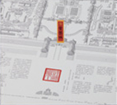
IN THE FORBIDDEN CITY
Creator: Alice Mak, Luk Chi-Cheong
Designer: Design and Cultural Studies Workshop, The Robert H.N. Ho Family Foundation
Year of Publication: 2010
This series of children’s books by Hong Kong designer Chiu Kwong-Chiu makes great reading for adults too. Except for a few splashes of red and yellow on the cover and the spine of the book, the entire volume is done in understated, elegant monochrome. While featuring cartoon characters, the drawings are lightly sketched, rather than boldly outlined. Each one of the buildings within is exquisitely rendered, many the result of repeated measurements made by Chiu and his team. So readers can better appreciate the details of the buildings’ design, a magnification lens card-inset is included with the book. The book is bound as Buddhist sutras once were. When opened to its full length, it forms a scroll some six meters long.
f.
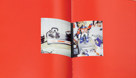
THE END OF THE MAINLAND
Designer: Birdhead
Publisher: 310 Publishing
Year of Publication: 2010
From its founding, Birdhead has treated its publications (or what they call their “portrait collections”) as the most important channel through which their work is transmitted. As such, they’ve doggedly stuck to a routine of every year collecting and publishing their photos from the year prior. In 2010 they established their own publishing company, 310 Publishing. Their design for The End of the Mainland, their latest book, divides the work into the “World of Color” and “The World of Black and White.” The divider between the two parts is bright red— almost excessively so. As with their previous books, the emphasis is on a veritable sea of photo spreads. For these photographer artists, the true significance of layouts lies in the construction of a visual and mental logic. The rest— the paper, the size of the book, and so on— is just details.
g.
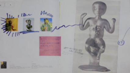
YUE MINJUN: LOOKING FOR ART
Designer: Chen Fangfei, Ji Yang
Publisher: Beijing Commune
Year of Publication: 2007
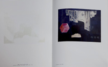
Yue Minjun’s “Looking for Art” paintings center around an imaginary art museum designed in the shape of a maze and exhibiting famous works of every shape and size. In subsequent pages, each one of the works on display is blown up to a larger size, then “pasted” into the pages of the book at odd angles. Well-known curators, art-world professionals, and even ordinary spectators get the pasting treatment, their notes and comments forming a multi-faceted commentary on art history.
h.
QIU XIAOFEI
Designer: Mei Shuzhi
Publisher: Boers-Li Gallery
Year of Publication: 2010
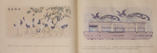
Qiu Xiaofei’s paintings, richly nostalgic in content, find primacy in the depiction of memory. In its binding and the works contained within, this catalogue is no different. White, green, and brown blocks fit together to form the cover, its pattern drawn from one of the artist’s renderings of apartments built during the 1970s and 1980s. Meticulously created prints of subdued ink sit in corresponding expanses of white, meant to recall the marks left by the era’s subpar printing technology. The absence of a page 33 hints at the state of mind with which Qiu is most often concerned.
i.
THE PHOENIX’S STORY: XU BING’S “PHOENIX PROJECT”
Designer: He Hao
Publisher: Xu Bing Studio
Year of Publication: 2010
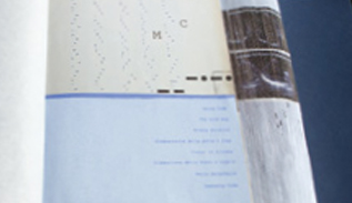
For his record of Xu Bing’s “Phoenix Project,” the designer chose to use ordinary, everyday brown parcel wrapping paper, in keeping with the rough, incomplete feel of the construction debris Xu used in this work. He Hao’s most difficult challenge came from the hodgepodge of materials (hand-painted drafts, computer-aided drawings, photos from construction sites and pulled off the Internet, etc.), accumulated over the project’s three years. At the same time, the quality of the selected pictures varied greatly. Some were exquisitely rendered, while others were just a few dozen kilobytes large. Printing was also a trial. The roughness of the parcel wrapping paper made for muddled printing results, forcing He to dial the printer’s resolution back to 45 DPI. But as his images became more granular, they also became brighter and more penetrating, a bit of innovation that won him an Asia Print Award.
j.
CODE DIARY
Designer: Lian Jie
Publisher: Self-Published
Year of Publication: 2010
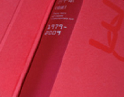
Code Diary is Lian Jie’s graduation design project. For 100 consecutive days he photographed himself at the exact same time and place in an attempt to suss out the relationship between self and environment. Every page in the book is of a different size, which increases progressively with page number. The binding forms a gradient with the book block behind it, bringing to mind the passage of time, and prompting one to consider the relationship between similarity and difference. But the gradient is not noticeable until one actually opens the book; turning the book over in one’s hands, it seems like an ordinary book, albeit one made of incredibly light paper. True to the book’s name, Lian uses a coded language of different symbols and images— whereas there is virtually no text— in order to express himself.
k.
THIRTY YEARS OF CHINESE CONTEMPORARY ART: PAINTING (1979-2009)
Designer: wx-design
Publisher: Culture and Art Publishing
Year of Publication: 2010
As the accompanying volume for Minsheng Art Museum’s first exhibition, this album, like the exhibition itself, plays things by the book. It evokes a classical dictionary: hard outer shell, hardcover binding, and a tripartite color scheme of red, white, and black. From the section divider pages to the page edges, red is everywhere, an implicit judgment on, or sentimentality toward, history.
l.
COLLIDER
Designer: Huang Yang
Publisher: SPACE E6
Year of Publication: 2010
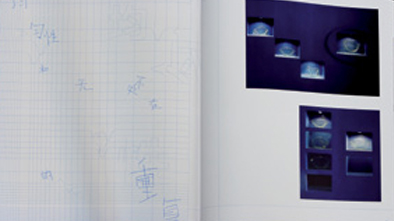
A collection of photographs by the young Greek artist Thanos Zakopoulos, Collider’s images seem almost devoid of subjects or focal points, yet they still convey a strong sense of space. Designer Huang took his cues from this spatial sensibility. Interlocking blue lines divide the space on the book’s cover and pages into uneven oblong spaces, some spaces big, other small, spaces thick and thin, a riot of irregular crosshatches meant to reflect the book’s differing spatial forms. In keeping with its international distribution, the book’s written passages are in English, although it does also have a few handwritten Chinese characters interspersed throughout. They seem to be for decoration more than anything else, scrawled across the page like writing on a wall, echoing the work’s sense of space.
m.
ZHANG YIKAI: DOUBLE IMAGE
Designer: Yang Linqing
Publisher: Dialogue Space
Year of Publication: 2009
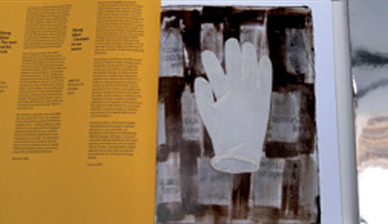
In Zhang Qikai’s work Mirage, “mirror” knife blades reflected the artist’s questioning of power. Drawing on Mirage, this book’s cover and spine are covered in a mirrored surface that extends around the cover and into the interior of the book. Only if one opens the book from the middle is it possible to read the characters inside, reflected off the surface of the mirror.
n.
A VILLAGE BY THE SEZ
Designer: Liu Zhizhi (To Meet You Design Studio)
Publisher: Wenhui Books
Year of Publication: 2010
A Village by the SEZ is a work of sociology exploring the development and present state of the village of Dafen, outside of Shenzhen. It is presented in a case bound like a hardcover book, inside of which are 16 separate printed works, including picture books, postcards, and pull-outs. Each item is printed on its own color of paper, and bound, like the case, as if it were a hardcover book. The choice of case was dictated by the constraints of the design process. Pressed for time, the designer was unable to rearrange the project’s jumble of associated documents and pictures into an orderly, logical book. The case was his solution. Additionally, the designer thought a case would better reflect the idea of Dafen and its surroundings. Famous around the world for its massproduced oil paintings, Dafen hopes to become a creative arts hub. But the reality hasn’t quite worked out as planned, somewhat reminiscent of the slender volumes of A Village by the SEZ that try so hard to be thick hardcover books. A case also represents an attitude of openness. There’s space within a case, space left for the reader, space that transforms the case into an object capable of growing with time.
o.
MA NÜ JIN NÜ
Designer: Xiao Mage + Chengzi
Publisher: Star Gallery
Year of Publication: 2011
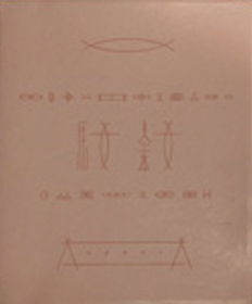
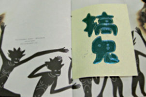
This catalogue of the young female artist Jin Nü’s first solo exhibition is strongly gendered, as the decorative patterns on its cover and in its pages indicate. Jin spent years searching for the right material for her sculptures, finally settling on one the same shade as human skin. In terms of feel and appearance, it is a material to which the soft pink leather of this book’s cover bears a strong resemblance. Ma Nü (lit: “horse woman”), an image that appears repeatedly in Jin’s work, seems almost to represent the artist herself, not least because the character for woman is contained within the character used to write her name. The designers stretched out that character, and derived from it a series of decorative designs used throughout the book.
p.
STRANGE HAPPENINGS IN NANTOU
Designer: Imagine Wong
Publisher: Self-Published
Year of Publication: 2006
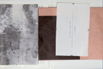
Strange Happenings in Nantou is one of theater director Wu Xi’s signature works. A few of its stories are set against the backdrop of Nantou, an area near Shenzhen University. Nantou has been a setting for ghost stories since the Ming Dynasty, and Wu’s new stories feed off its reputation for the frightening and the occult. To properly convey the tone of Wu’s stories, for the pages separating one chapter from another, designer Imagine Wong used a kind of yellow, handmade paper typically reserved for burnt offerings for the deceased. He stamped the dividing pages with bright blue characters (traditionally the color of shrouds), then held the book over a fire, singeing the edges for a spooky touch.
q.
ON THE WAY TO SHANGRI-LA
Designer: He Jun
Publisher: Guo Moruo Memorial House
Year of Publication: 2009
A creation of four professors at the Central Academy of Fine Arts (Guang Jun, Sun Jiabo, Xu Zhong’ou, and Hu Wei), On the Way to Shangri-La is marked by the contrasts between their work, the better to show off their contrasting styles. Designer He Jun engages the four professors’ work with paper of different construction and size. On the back of each sheet, the name of the work is written vertically along with information about the material used, and half of the artist’s name (the other half is cut off). The works are contained in a thin, flat, bound cardboard case colored in delicate gray or green, the names of each artist written on each side of the case as a sign of the four’s interconnectedness.
r.
UNTIL THE END OF THE ROAD
Designer: Wang Zhihong
Publisher: Ecus Publishing (Taiwan)
Year of Publication: 2010
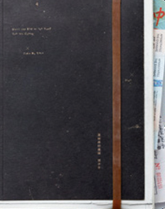
Until the End of the Road recounts author Zhang Ziwu’s journey across the Eurasian continent by bike; thus designer Wang Zhihong’s decision to mimic a travel diary. The tiny letters of the book’s name are written on its scratched, scarred black cover, while a thick rubber band holds closed a “notebook” stuffed with souvenirs of the journey (postcards, tickets, etc.). Wang left no stone unturned in his quest for a “used” feel. The postcards and ticket stubs are copies of real articles, thrown into a washing machine after printing for a “wrinkled” look. The pages stick out past the cover, like the notebook is starting to shed its insides. Wang was so successful that some readers thought they had bought damaged copies of the book, and demanded that the publisher return their money. As a result, the publisher decided to make changes to the book in its second printing.
s.
SEVEN AND A HALF
Designer: Ben Lee
Publisher: GOELIA concept 225
Year of Publication: 2010
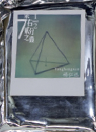
Photographer Yang Hongxun is a Polaroid fanatic as well as an admirer of Robert Frank, two affinities that are evident in this design. Each of his book’s pictures imitates the visual texture of a Polaroid photograph, covered with a spot UV layer. A careful glance reveals though that the size has been adjusted ever so slightly, made just a bit smaller than a real Polaroid while still preserving the ratio of the famous Polaroid white border even at these new proportions. Yang and designer Ben Lee packaged the eight booklets in a sealed pouch made from aluminium foil, just like the packaging for Polaroid film, ensuring that the contents would remain protected during the shipping process.
